The Sell-Outs vs. The Knowledge
When it comes to creative direction, ARTCRANK has erred on the side of a hands-off approach for most of our history. Like the majority of the artists we work with, I come from a background in advertising and graphic design — in my case as a copywriter and creative director. I cut my professional teeth in agencies large and small, where creativity was respected and admired but also subject to multiple layers of review and approval from management and clients alike.
The process of shepherding an idea from concept through creation can be a heroic tale of dogged persistence, passionate conviction, and triumph in the face of adversity that ends in a stunning campaign of career-making brilliance. But it can also be tragic farce dragged out miserably over months of second-guessing, nitpicking, mish-mashing, focus-grouping, and other unspeakable mutations and indignities that leave you with a stunted, misbegotten creature you’d rather bury in a vacant lot at midnight and never speak of again.
As much as ARTCRANK is the product of a lifelong love of bicycles and art, it’s also forged from a desire to provide talented artists, designers, and illustrators an outlet to create work they love, unfettered by creative briefs, clients, budgets, and the myriad complications that take root at the intersection of creativity and commerce. At the same time, ARTCRANK is also a business. As such, it’s in our best interest, and the best interest of our artists and audience, to feature work that has the best possible chance of appealing to the greatest number of people.
So as ARTCRANK ventured beyond Minneapolis, we kept close tabs on what kinds of posters resonated most with the audience in each city we visited. Patterns that transcended geography and artistic style emerged, and we began passing that information along to the artists who were selected for our shows.
Eventually, I formalized it into a PDF called The Knowledge (I nicked the title from London’s famously rigorous exam for taxi drivers). It currently weighs in at just over six pages with no photos, and I won’t subject you to it in its entirety. But here’s an excerpt:
The substance of said friendly advice can be summarized in these four essential points:
> Simple is better than Complicated
> Graphics are better than Words
> Bright/Colorful is better than Dark/Monochromatic
> Concrete is better than Abstract
Our Bike Poster Shop has been in business for just over a month. We run the shop on a limited-time, limited-edition system that’s in many ways similar to our shows: 30 poster designs by different artists, 30 prints of each available for purchase, for a period of 30 days or until they sell out — whichever comes first.
Among our initial selection of posters, six prints sold out completely. Being the curious type, I wanted to see how the design principles conveyed in The Knowledge — a document compiled from what we’d learned by doing live shows — stacked up against what people bought in our online store. Here’s my semi-impartial assessment of each design:

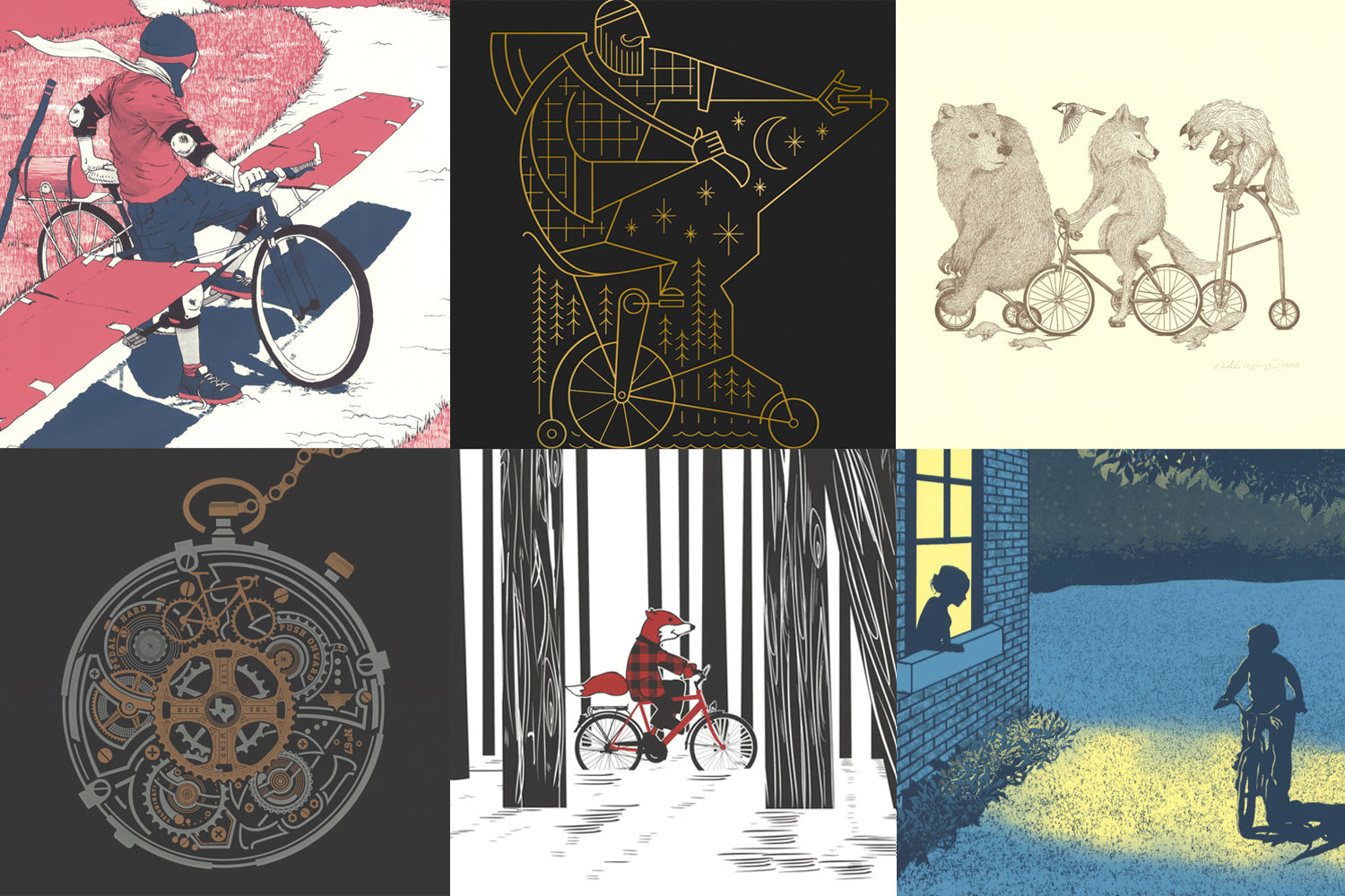
Flying Machine, by Brendan Totten
Simple is better than Complicated? YES
Graphics are better than Words? YES
Bright/Colorful is better than Dark/Monochromatic? YES
Concrete is better than Abstract? YES
This poster originally appeared in our 2014 Boston show with a slightly different color scheme, and printed using a different technique. It sold out there, too. While the subject has their sights set a little higher than most, anyone who’s ever felt the flight-like freedom of riding a bike for the first time can put themselves in their shoes. When you look at it, you can feel something’s about to happen, and you want to see it — or be it.

Scarves of Red, by Jenn Levo
Simple is better than Complicated? YES
Graphics are better than Words? YES
Bright/Colorful is better than Dark/Monochromatic? MAYBE
Concrete is better than Abstract? YES
Jenn Levo has had a poster in every single Portland show we’ve ever done, and every design features an animal riding a bike. This one, from our 2011 show, has always been my favorite. While some posters convey the frantic, chaotic energy of riding at breakneck speed through the concrete jungle, this perfectly captures the quiet joy of a solitary ride through silent, snowy woods. While the setting is a stark black and white, smiling Mr. Fox in his red flannel shirt is all of the colorful and adorable you’ll ever need.

Night Ride, by Ross Bruggink
Simple is better than Complicated? YES
Graphics are better than Words? YES
Bright/Colorful is better than Dark/Monochromatic? MAYBE
Concrete is better than Abstract? YES
Making mind-blowingly beautiful things with simple, geometric shapes is Ross Bruggink’s signature, and we’ve been fortunate enough to feature his work in numerous Minneapolis shows. While the line work here is intricate, the execution — gold foil on dark paper — is as simple as possible, and the results are stunning. Sometimes, when we pull a poster out for the first time, we turn to each other and say something to the effect of “We’re going to sell a shit-ton of these.” This was one of those times.

Riding Time, by Roy Milton
Simple is better than Complicated? NO
Graphics are better than Words? YES
Bright/Colorful is better than Dark/Monochromatic? MAYBE
Concrete is better than Abstract? NO
On the other hand, sometimes we see a poster for the first time and say, “Damn, that’s incredible. But will people take the time to appreciate everything that’s going on?” In this case, they absolutely did — at both our 2014 Austin show where it originally appeared, and in the Bike Poster Shop. The visual metaphor is genius, and the design is like, well, clockwork. Honestly, this one bends or breaks most of the “rules” from The Knowledge. But for every rule, there’s an exception. And this is an exceptionally stellar feat of poster design and letterpress printing.

A Bike Parade, by Natalie Wynings
Simple is better than Complicated? YES
Graphics are better than Words? YES
Bright/Colorful is better than Dark/Monochromatic? NO
Concrete is better than Abstract? YES
This one elicited an honest to goodness “Aww…” from me the first time I saw it in 2012 at our Minneapolis show. For starters, the level of detail in the illustration is incredible. And while it’s a one-color letterpress print, the warmth of the ink and the tooth of the paper create a sense of dimension that doesn’t need more color. And the fox? The poor little fox trying to pedal that big ol’ bike? And the bear? On a tricycle! And the wolf, who’s all like “Come on, bro. We ain’t got all day.” Gimme a tissue, I’m tearing up here.

End of Summer, by Arsenal Handicraft
Simple is better than Complicated? YES
Graphics are better than Words? YES
Bright/Colorful is better than Dark/Monochromatic? MAYBE
Concrete is better than Abstract? YES
John Hughes made a mint making movies with awkward-yet-precocious teens being rebellious and adventurous and cool in ways that pushed the bounds of plausible. Movies that somehow warmed and broke your heart at the same time, even as every muscle in your body strained to continue suspending disbelief. This poster is a scene from a John Hughes movies that was never made, but is somehow even more perfect because there’s a pure, true-blue innocence to it. Sometimes, we see posters for the first time and say, “I hope everybody falls in love with this.” And sometimes, they do.
Want to make a poster for the ARTCRANK Bike Poster Shop? Awesome. Just send an email to info@artcrank.com, and we’ll give you the lowdown.
Also in News
Every Ride Has An End
And now for something completely different.
We’ve made changes to the way we operate to accommodate the series of new realities we’ve found ourselves in since March. We’ve also had a chance to bear down and focus on some ideas that we’ve had in the works for a long time and just hadn’t had the time to pull off. Our new site is one of them.
Charles Youel
Author