Making the Poster for the King of Bike Poster Parties
After nine years and more than 60 shows in three countries, there’s only one thing about ARTCRANK that’s never changed: Our Minneapolis show is always our biggest event of the year.
Sure, it helps that Minneapolis is our home base, that it’s an amazing bike town with an incredibly talented creative community, and that we’ve done more events here than in any other city. But where our best show openings in other parts of the U.S. attract crowds 1,000 – 1,200 people, attendance at the opening night show in Minneapolis has topped 5,000 for four years running.
When we plan our Minneapolis show every year, we try to pull out all the stops. From food trucks and coffee carts to live music and live tattooing, we’re always trying to top what we did the previous year and deliver something fresh and amazing. The same can be said for the signature posters that Twin Cities artists have created for us over the years.
For 2015, we wanted to do something extra-special for Minneapolis. Luckily for us, Colle McVoy designer Sam Soulek was more than up for the challenge.

Describing his approach to the initial concepts that led to the final design, he says, “I wanted to express the idea that our eclectic bike community needs one another to move forward. It’s a bit wild here with bike gangs, tall bikes, bike parades, art bikes, and whatnot. We’re all unique, different, yet connected. ‘MPLS’ is local shorthand for Minneapolis. The inspiration was simply those two ideas mashed together.”
“The simplicity of the idea and execution made this concept my favorite,” he adds. “It wasn’t intended to be overly clever, cocky or funny, just fun. And a little fancy.”
Sam’s idea of “a little fancy” involved combining the most popular printing method for ARTCRANK posters — screen-printing — with something we’ve always wanted to work with: Foil stamping. So we asked ARTCRANK artists who’d worked foil stamping before for a recommendation, and the unanimous and enthusiastic choice was McIntosh Embossing.

The folks at McIntosh describe themselves as “masters of the time-honored crafts of embossing, foil stamping and die cutting.” To borrow from the great Dizzy Dean, it ain’t bragging if you can do it.
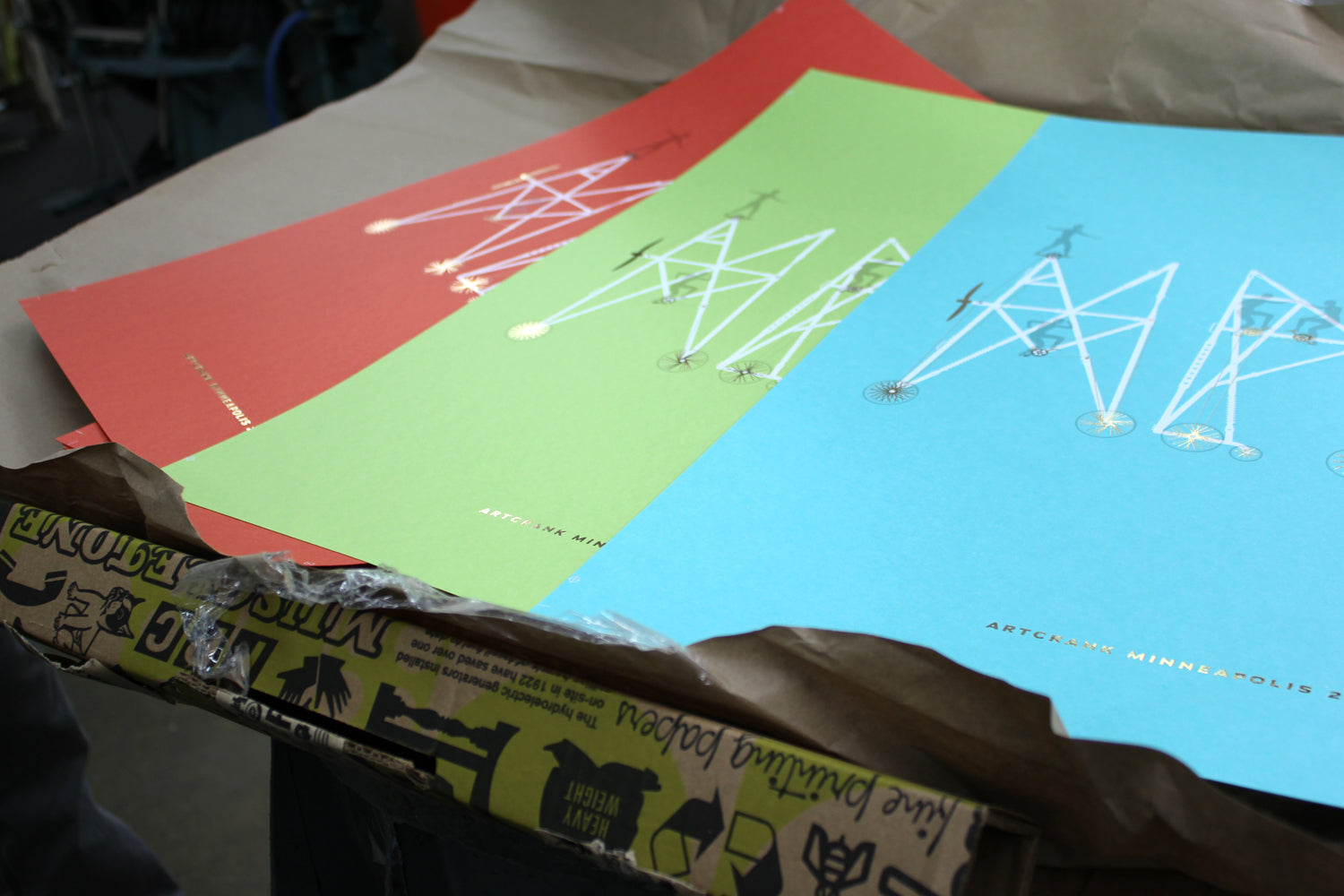
And while we typically produce one version of our show posters, Sam had something a little bigger in mind. His pitch for the poster design included not one, not two but three color versions on French Paper Pop-Tone: Tangy Orange, Sour Apple, and Blue Raspberry. As he tells it, “This color palette is inescapable for me. It has followed me through the last decade or so of my career. The colors are simply bright, fun, and live well together. And they all make great sock colors.”

Just before we were set to send the designs to Steady Print Shop in Minneapolis for the screen-printing side of the equation, Sam had a spark of inspiration that led him to add a new level of detail to the letterform bikes in his design.
“The spoke and crank details are based on actual custom component designs,” he says. “Initially they were all the same, but by varying the designs it more clearly expressed the diversity of our bike culture. The frame design details were added at the last minute.”

So how did it all turn out? We’ll let the photos do most of the talking, with a little commentary from Sam interspersed.

“The combination of transparent gray and opaque white screen-printing under gold foil stamping on colored paper are some of my favorite production techniques. Combining them into one poster was a dream come true. It was the perfect opportunity to do so based on the simplicity of the design and layout.”

“I knew screen-printing and foil stamping would add their own character, so I kept all my line-work clean. I worked with the printers to make sure we were riding the line without going over. The end result was slight imperfections that add to the tactile quality of the poster without distorting it.”

“The enthusiasm of everyone involved was the most rewarding to me. The client, the printers and people that attended ARTCRANK, showed so much authentic excitement over the event that it made me happy to finally be a part of it."

“Erik at Steady Print Co can do anything in no time flat. And Dave at McIntosh embossing turns stuff gold. I want to continue working with all of them, and you should too.”

Thanks to Sam Soulek and Colle McVoy, Erik Hamline of Steady Print Shop, Brian French and French Paper, and of course Dave McIntosh and McIntosh Embossing for making this poster project happen.

Also in News
Every Ride Has An End
And now for something completely different.
We’ve made changes to the way we operate to accommodate the series of new realities we’ve found ourselves in since March. We’ve also had a chance to bear down and focus on some ideas that we’ve had in the works for a long time and just hadn’t had the time to pull off. Our new site is one of them.
Charles Youel
Author